文章目录
- import matplotlib.pyplot as plt # 创建数据 x = [1, 2, 3, 4, 5] y = [2, 3, 5, 7, 11] # 使用matplotlib绘制散点图 plt.scatter(x, y, label=’Data Points’, color=’blue’, marker=’o’) # 添加标签和标题 plt.xlabel(‘X-axis’) plt.ylabel(‘Y-axis’) plt.title(‘Scatter Plot’) # 添加图例和网格 plt.legend() plt.grid(True) # 显示图形 plt.show()
- import seaborn as sns import matplotlib.pyplot as plt # 创建数据 x = [1, 2, 3, 4, 5] y = [2, 3, 5, 7, 11] # 使用Seaborn绘制散点图 sns.scatterplot(x=x, y=y, label=’Data Points’) # 添加标签和标题 plt.xlabel(‘X-axis’) plt.ylabel(‘Y-axis’) plt.title(‘Scatter Plot’) # 添加图例和网格 plt.legend() plt.grid(True) # 显示图形 plt.show()
- from pyecharts.charts import Scatter
from pyecharts import options as opts
# 创建数据
data = [(1, 2), (2, 3), (3, 5), (4, 7), (5, 11)]
# 创建散点图对象
scatter = (
Scatter()
.add_xaxis([x for x, y in data])
.add_yaxis(“Data Points”, [y for x, y in data])
.set_series_opts(label_opts=opts.LabelOpts(is_show=False))
.set_global_opts(
title_opts=opts.TitleOpts(title=”Scatter Plot”),
xaxis_opts=opts.AxisOpts(name=”X-axis”),
yaxis_opts=opts.AxisOpts(name=”Y-axis”),
)
)
# 渲染图表
# 如果在Jupyter Notebook中运行,使用render_notebook()
scatter.render_notebook()
# 如果在普通Python脚本中运行,使用render()保存为HTML文件
# scatter.render(“scatter_plot.html”)
- 导入库:from pyecharts.charts import Scatter 和 from pyecharts import options as opts 创建数据:data = [(1, 2), (2, 3), (3, 5), (4, 7), (5, 11)] 创建散点图对象:scatter = Scatter().add_xaxis([x for x, y in data]).add_yaxis("Data Points", [y for x, y in data]) 设置系列选项:set_series_opts(label_opts=opts.LabelOpts(is_show=False)) 设置全局选项:set_global_opts(title_opts=opts.TitleOpts(title="Scatter Plot"), xaxis_opts=opts.AxisOpts(name="X-axis"), yaxis_opts=opts.AxisOpts(name="Y-axis")) 渲染图表:在Jupyter Notebook中使用render_notebook(),在普通Python脚本中使用render("scatter_plot.html")
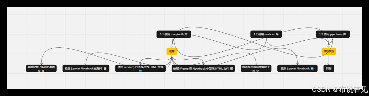
- 如果你在Jupyter Notebook中运行这段代码,但是图表没有显示出来,可能是因为render_notebook()方法没有被正确执行,或者你的环境配置有问题。下面是一些可能的解决方案: 1. 确保安装了所有必要的库 首先,确保已经安装了pyecharts及其相关依赖。可以使用以下命令来安装: pip install pyecharts 2. 检查Jupyter Notebook的版本 确保使用的Jupyter Notebook版本支持render_notebook()方法。通常情况下,较新版本的Jupyter Notebook应该没有问题。 3. 使用render()方法保存为HTML文件 如果render_notebook()方法不起作用,可以尝试将图表保存为HTML文件,然后手动打开这个文件查看图表。 # 渲染图表并保存为HTML文件 scatter.render(“scatter_plot.html”) 保存后,你可以在文件浏览器中找到scatter_plot.html文件并双击打开它,查看图表。 4. 使用IFrame在Notebook中显示HTML文件 如果你希望在Jupyter Notebook中直接显示HTML文件,可以使用IPython.display.IFrame来实现。 from IPython.display import IFrame # 渲染图表并保存为HTML文件 scatter.render(“scatter_plot.html”) # 在Notebook中显示HTML文件 IFrame(‘scatter_plot.html’, width=800, height=600) 5. 检查是否有其他输出干扰 有时候,Jupyter Notebook中的其他输出可能会干扰图表的显示。确保在执行绘图代码之前没有其他输出。 6. 重启Jupyter Notebook 如果以上方法都不奏效,可以尝试重启Jupyter Notebook服务器,有时这可以解决一些临时性的问题。
目录
- 数据可视化
- 1.使用 matplotlib 库
- matplotlib 库
- 2 .使用 seaborn 库
- seaborn 库
- 3 .使用 pyecharts库
- pyecharts库
- 注意
- 比较三种库的特点
- 选择建议
- 目标
- 总结
import matplotlib.pyplot as plt

# 创建数据
x = [1, 2, 3, 4, 5]
y = [2, 3, 5, 7, 11]

# 使用matplotlib绘制散点图
plt.scatter(x, y, label='Data Points', color='blue', marker='o')

# 添加标签和标题
plt.xlabel('X-axis')
plt.ylabel('Y-axis')
plt.title('Scatter Plot')

# 添加图例和网格
plt.legend()
plt.grid(True)

# 显示图形
plt.show()
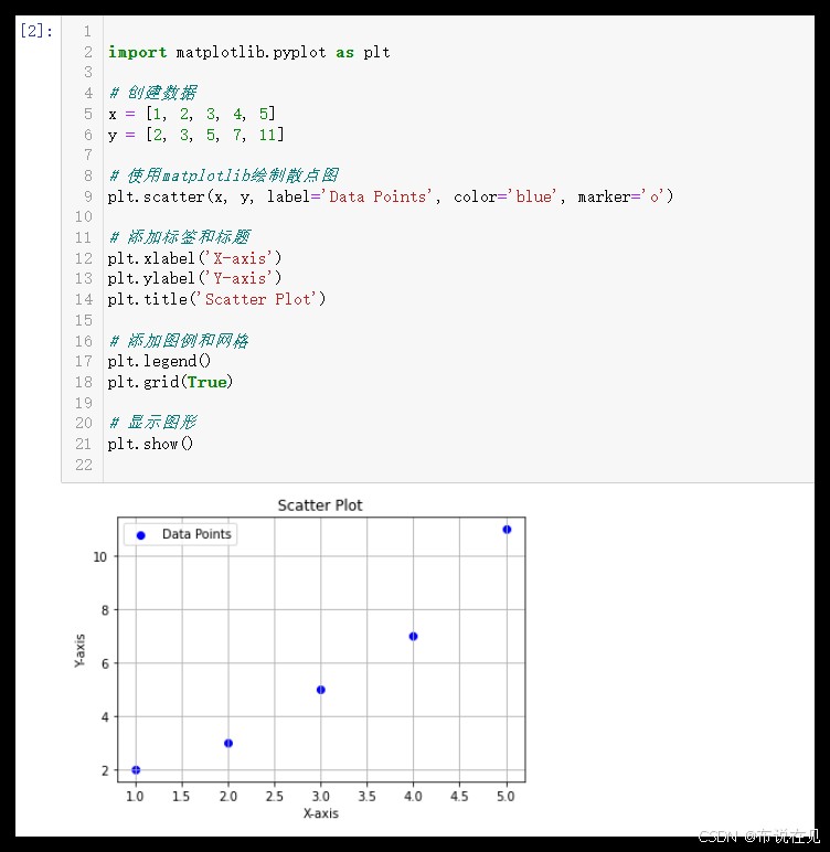
- 导入库:
import matplotlib.pyplot as plt
- 创建数据:
x = [1, 2, 3, 4, 5] 和 y = [2, 3, 5, 7, 11]
- 绘制散点图:
plt.scatter(x, y, label='Data Points', color='blue', marker='o')
- 添加标签和标题:
plt.xlabel('X-axis'),plt.ylabel('Y-axis'),plt.title('Scatter Plot')
- 添加图例和网格:
plt.legend(),plt.grid(True)
- 显示图形:
plt.show()
import matplotlib.pyplot as pltx = [1, 2, 3, 4, 5] 和 y = [2, 3, 5, 7, 11]plt.scatter(x, y, label='Data Points', color='blue', marker='o')plt.xlabel('X-axis'),plt.ylabel('Y-axis'),plt.title('Scatter Plot')plt.legend(),plt.grid(True)plt.show()
import seaborn as sns
import matplotlib.pyplot as plt

# 创建数据
x = [1, 2, 3, 4, 5]
y = [2, 3, 5, 7, 11]

# 使用Seaborn绘制散点图
sns.scatterplot(x=x, y=y, label='Data Points')

# 添加标签和标题
plt.xlabel('X-axis')
plt.ylabel('Y-axis')
plt.title('Scatter Plot')

# 添加图例和网格
plt.legend()
plt.grid(True)

# 显示图形
plt.show()
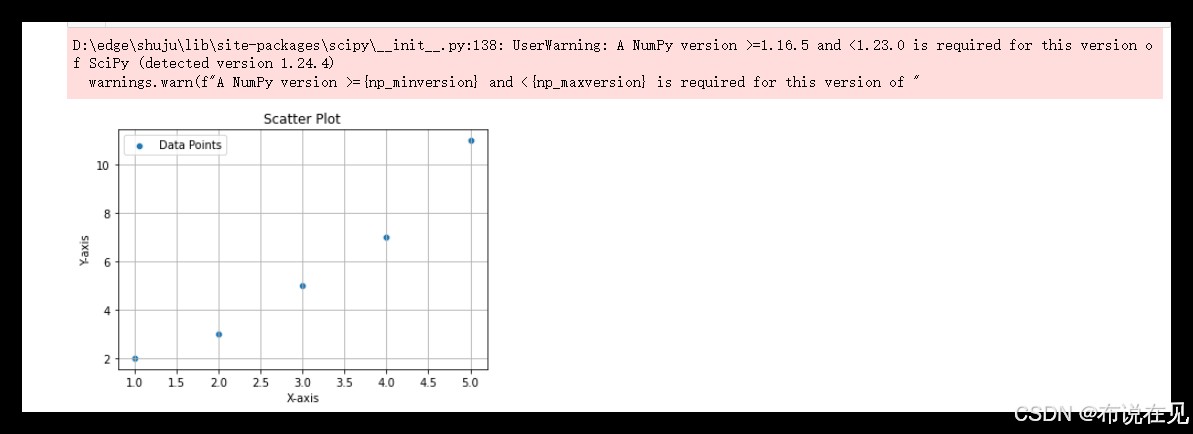
- 导入库:
import seaborn as sns 和 import matplotlib.pyplot as plt
- 创建数据:
x = [1, 2, 3, 4, 5] 和 y = [2, 3, 5, 7, 11]
- 绘制散点图:
sns.scatterplot(x=x, y=y, label='Data Points')
- 添加标签和标题:
plt.xlabel('X-axis'),plt.ylabel('Y-axis'),plt.title('Scatter Plot')
- 添加图例和网格:
plt.legend(),plt.grid(True)
- 显示图形:
plt.show()
import seaborn as sns 和 import matplotlib.pyplot as pltx = [1, 2, 3, 4, 5] 和 y = [2, 3, 5, 7, 11]sns.scatterplot(x=x, y=y, label='Data Points')plt.xlabel('X-axis'),plt.ylabel('Y-axis'),plt.title('Scatter Plot')plt.legend(),plt.grid(True)plt.show()
from pyecharts.charts import Scatter
from pyecharts import options as opts

# 创建数据
data = [(1, 2), (2, 3), (3, 5), (4, 7), (5, 11)]

# 创建散点图对象
scatter = (
    Scatter()
    .add_xaxis([x for x, y in data])
    .add_yaxis("Data Points", [y for x, y in data])
    .set_series_opts(label_opts=opts.LabelOpts(is_show=False))
    .set_global_opts(
        title_opts=opts.TitleOpts(title="Scatter Plot"),
        xaxis_opts=opts.AxisOpts(name="X-axis"),
        yaxis_opts=opts.AxisOpts(name="Y-axis"),
    )
)

# 渲染图表
# 如果在Jupyter Notebook中运行,使用render_notebook()
scatter.render_notebook()

# 如果在普通Python脚本中运行,使用render()保存为HTML文件
# scatter.render("scatter_plot.html")
- 导入库:
from pyecharts.charts import Scatter 和 from pyecharts import options as opts
- 创建数据:
data = [(1, 2), (2, 3), (3, 5), (4, 7), (5, 11)]
- 创建散点图对象:
scatter = Scatter().add_xaxis([x for x, y in data]).add_yaxis("Data Points", [y for x, y in data])
- 设置系列选项:
set_series_opts(label_opts=opts.LabelOpts(is_show=False))
- 设置全局选项:
set_global_opts(title_opts=opts.TitleOpts(title="Scatter Plot"), xaxis_opts=opts.AxisOpts(name="X-axis"), yaxis_opts=opts.AxisOpts(name="Y-axis"))
- 渲染图表:在Jupyter Notebook中使用
render_notebook(),在普通Python脚本中使用render("scatter_plot.html")
from pyecharts.charts import Scatter 和 from pyecharts import options as optsdata = [(1, 2), (2, 3), (3, 5), (4, 7), (5, 11)]scatter = Scatter().add_xaxis([x for x, y in data]).add_yaxis("Data Points", [y for x, y in data])set_series_opts(label_opts=opts.LabelOpts(is_show=False))set_global_opts(title_opts=opts.TitleOpts(title="Scatter Plot"), xaxis_opts=opts.AxisOpts(name="X-axis"), yaxis_opts=opts.AxisOpts(name="Y-axis"))render_notebook(),在普通Python脚本中使用render("scatter_plot.html")
如果你在Jupyter Notebook中运行这段代码,但是图表没有显示出来,可能是因为render_notebook()方法没有被正确执行,或者你的环境配置有问题。下面是一些可能的解决方案:
1. 确保安装了所有必要的库
首先,确保已经安装了pyecharts及其相关依赖。可以使用以下命令来安装:
pip install pyecharts
2. 检查Jupyter Notebook的版本
确保使用的Jupyter Notebook版本支持render_notebook()方法。通常情况下,较新版本的Jupyter Notebook应该没有问题。
3. 使用render()方法保存为HTML文件
如果render_notebook()方法不起作用,可以尝试将图表保存为HTML文件,然后手动打开这个文件查看图表。
# 渲染图表并保存为HTML文件
scatter.render("scatter_plot.html")
保存后,你可以在文件浏览器中找到scatter_plot.html文件并双击打开它,查看图表。
4. 使用IFrame在Notebook中显示HTML文件
如果你希望在Jupyter Notebook中直接显示HTML文件,可以使用IPython.display.IFrame来实现。
from IPython.display import IFrame

# 渲染图表并保存为HTML文件
scatter.render("scatter_plot.html")

# 在Notebook中显示HTML文件
IFrame('scatter_plot.html', width=800, height=600)
5. 检查是否有其他输出干扰
有时候,Jupyter Notebook中的其他输出可能会干扰图表的显示。确保在执行绘图代码之前没有其他输出。
6. 重启Jupyter Notebook
如果以上方法都不奏效,可以尝试重启Jupyter Notebook服务器,有时这可以解决一些临时性的问题。
| 库 | 特点 | 适用场景 |
|---|---|---|
matplotlib |
基础库,支持自定义,静态图表 | 科研论文,数据分析报告 |
seaborn |
基于 matplotlib,样式美观 |
统计分析,探索性数据分析 |
pyecharts |
交互性强,适合网页展示 | 数据展示,交互式仪表板 |
- 如果需要在科研或数据分析中生成静态图表,
matplotlib 是基础且可靠的选择。
- 需要更多美观效果和便捷的统计分析时,
seaborn 提供了友好的界面。
- 若要在网页中展示交互式图表,
pyecharts 能生成包含交互功能的 HTML 文件,非常适合网络发布。
matplotlib 是基础且可靠的选择。seaborn 提供了友好的界面。pyecharts 能生成包含交互功能的 HTML 文件,非常适合网络发布。
- 学习和实践:通过实际操作,掌握使用
matplotlib、seaborn 和 pyecharts 绘制散点图的方法。
- 比较不同库的特点:了解每个库的优缺点,选择最适合具体需求的工具。
- 数据可视化:通过散点图展示数据之间的关系,帮助更好地理解和解释数据。
matplotlib、seaborn 和 pyecharts 绘制散点图的方法。
嘿,数据可视化这事儿暂时要告一段落啦,不过以后有机会的话,咱还能再写写关于数据可视化的东西。😎
到此这篇关于Python绘图工具使用Matplotlib、Seaborn和Pyecharts绘制散点图的文章就介绍到这了,更多相关Matplotlib、Seaborn和Pyecharts绘制散点图内容请搜索风君子博客以前的文章或继续浏览下面的相关文章希望大家以后多多支持风君子博客!
您可能感兴趣的文章:
- Python+Pyecharts实现散点图的绘制
- 利用pyecharts绘制地理散点图
- Python绘制散点图之可视化神器pyecharts
- python学习之matplotlib绘制散点图实例
- python使用matplotlib模块绘制多条折线图、散点图
- Python matplotlib 绘制散点图详解建议收藏
- python使用matplotlib画柱状图、散点图
- 使用matplotlib中scatter方法画散点图
- python3使用matplotlib绘制散点图
- python使用seaborn绘图直方图displot,密度图,散点图